Topic 2, Contoso Ltd, Case Study
Overview
This is a case study. Case studies are not timed separately. You can use as much exam
time as you would like to complete each case. However, there may be additional case
studies and sections on this exam. You must manage your time to ensure that you are able
to complete all questions included on this exam in the time provided.
To answer the questions included in a case study, you will need to reference information
that is provided in the case study. Case studies might contain exhibits and other resources
that provide more information about the scenario that is described in the case study. Each
question is independent of the other questions in this case study.
At the end of this case study, a review screen will appear. This screen allows you to review
your answers and to make changes before you move to the next section of the exam. After
you begin a new section, you cannot return to this section.
To start the case study
To display the first question in this case study, click the Next button. Use the buttons in the
left pane to explore the content of the case study before you answer the questions. Clicking
these buttons displays information such as business requirements, existing environment
and problem statements. If the case study has an All Information tab, note that the
information displayed is identical to the information displayed on the subsequent tabs.
When you are ready to answer a question, click the Question button to return to the
question.
Existing Environment
Contoso, Ltd. is a manufacturing company that produces outdoor equipment Contoso has
quarterly board meetings for which financial analysts manually prepare Microsoft Excel
reports, including profit and loss statements for each of the company's four business units,
a company balance sheet, and net income projections for the next quarter.
Data and Sources
Data for the reports comes from three sources. Detailed revenue, cost and expense data
comes from an Azure SQL database. Summary balance sheet data comes from Microsoft
Dynamics 365 Business Central. The balance sheet data is not related to the profit and
loss results, other than they both relate to dates.
Monthly revenue and expense projections for the next quarter come from a Microsoft
SharePoint Online list. Quarterly projections relate to the profit and loss results by using the
following shared dimensions: date, business unit, department, and product category.
Net Income Projection Data
Net income projection data is stored in a SharePoint Online list named Projections in the
format shown in the following table.
You have two CSV files named Products and Categories.
The Products file contains the following columns:
ProductID
ProductName
SupplierID
CategoryID
The Categories file contains the following columns:
CategoryID
CategoryName
CategoryDescription
From Power BI Desktop, you import the files into Power Query Editor.
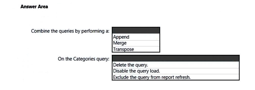
You need to create a Power BI dataset that will contain a single table named Product. The Product will table includes the following columns:
ProductID
ProductName
SupplierID
CategoryID
CategoryName
CategoryDescription
How should you combine the queries, and what should you do on the Categories query?
To answer, select the appropriate options in the answer area.
NOTE: Each correct selection is worth one point.
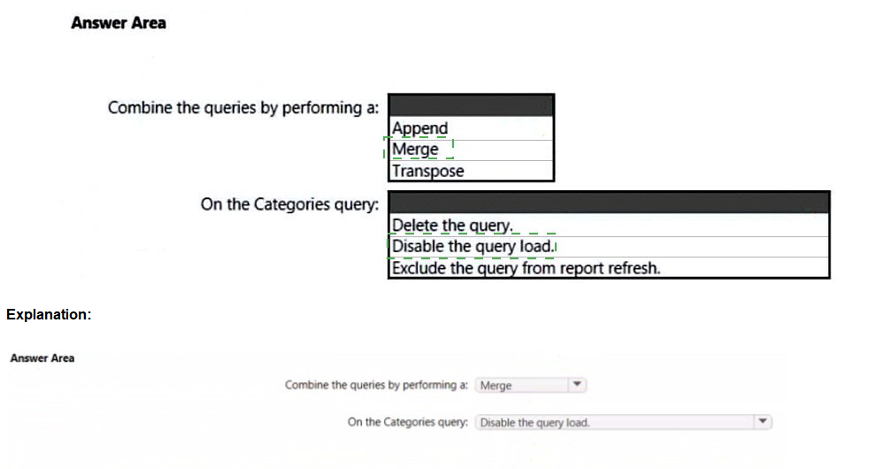
Explanation:
You need to combine Products and Categories into a single Product table that includes columns from both tables. Since both tables share a common CategoryID field and you need to add CategoryName and CategoryDescription from Categories to Products, this requires a relational join operation. This is achieved by merging the tables in Power Query Editor using CategoryID as the matching column. After merging, the Categories query is no longer needed as a separate table in the dataset.
Correct Option:
Combine the queries by performing a: Merge
Merge combines two tables based on matching columns, allowing you to expand related columns from one table into another. This is exactly what you need to add CategoryName and CategoryDescription from Categories into Products using CategoryID as the key. The result will be a single Product table containing all required columns.
On the Categories query: Disable the query load
Disabling the query load prevents the Categories table from being loaded into the Power BI data model while keeping the query available in Power Query Editor for transformation and merge operations. This ensures only the merged Product table appears in the dataset, meeting the requirement of a single table.
Incorrect Options:
Combine the queries by performing a: Append
Append stacks rows from one table below another, requiring identical column structures. Products and Categories have completely different columns, so appending would not combine related data horizontally. This would not achieve the goal of adding Category columns to each Product row.
Combine the queries by performing a: Transpose
Transpose rotates tables, swapping rows and columns. This operation is irrelevant for combining related data from two tables and would not accomplish the required column addition. Transpose is typically used for pivoting or restructuring data, not relational joins.
On the Categories query: Delete the query
Deleting the Categories query entirely would remove the source for the merge operation. The merge requires the Categories query to exist in Power Query Editor at design time to establish the relationship and expand columns. Deletion would break the transformation.
On the Categories query: Exclude the query from report refresh
Excluding from report refresh prevents the query from refreshing but still loads the table into the model initially. The requirement is to have only one Product table in the dataset, so you need to prevent loading entirely, not just disable refresh.
Reference:
Microsoft Learn: Merge queries (Power Query) - https://learn.microsoft.com/en-us/power-query/merge-queries
Note: This question is part of a series of questions that present the same scenario. Each question in the series contains a unique solution that might meet the stated goals. Some question sets might have more than one correct solution, while others might not have a correct solution.
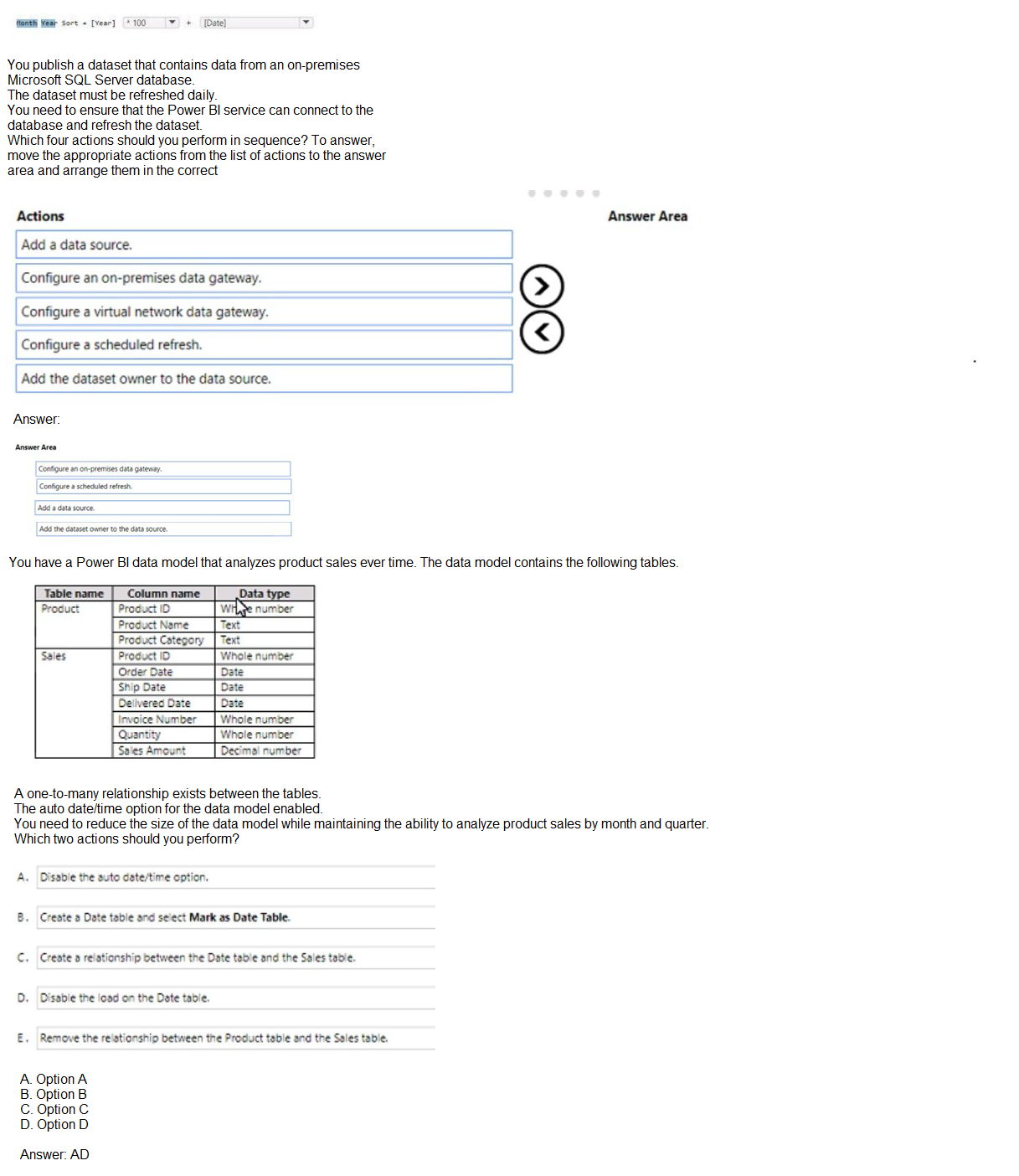
After you answer a question in this section, you will NOT be able to return to it. As a result, these questions will not appear in the review screen. From Power Query Editor, you profile the data shown in the following exhibit.

The IOT ID columns are unique to each row in query.
You need to analyze 10T events by the hour and day of the year. The solution must improve dataset performance.
Solution: You create a custom column that concatenates the 10T GUID column and the IoT ID column and then delete the IoT GUID and IoT ID columns.
Does this meet the goal?
A.
Yes
B.
No
No
Explanation:
The goal is to analyze IoT events by hour and day of the year while improving dataset performance. The solution creates a custom column concatenating IoT GUID and IoT ID, then deletes the original columns. This approach does nothing to enable time-based analysis by hour or day of the year, nor does it improve performance. In fact, adding calculated columns in Power Query increases model size and refresh time, which degrades performance.
Correct Option:
B. No
This solution fails to meet the goal for two reasons. First, it does not create any date/time columns or extract hour/day components needed for the required analysis. Second, adding unnecessary concatenated columns increases the data model size and import time, which harms rather than improves performance. The IoT DateTime column already exists and should be used to create Date and Time hierarchies or extract components.
Incorrect Option:
A. Yes
This is incorrect because concatenating two ID columns is irrelevant to time-based analysis. The requirement is to analyze events by hour and day of the year, which requires working with the IoT DateTime column. Additionally, deleting original columns while adding a new concatenated column does not improve performance and typically makes the model larger and slower.
Reference:
star-schema
The table has the following columns.
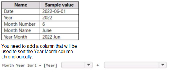
Explanation:
You need to sort the "Year Month" column (which displays as "2022 Jun") in chronological order. Currently, it sorts alphabetically, which would place "2022 Apr" before "2022 Jan" because "Apr" comes before "Jan" alphabetically. The solution creates a calculated column named "Month Year Sort" using = [Year] but this only contains the year value, which is insufficient for proper chronological sorting within the same year.
Correct Option:
B. No
This solution does not meet the goal. The "Month Year Sort" column only contains the year value, meaning all months within the same year would have identical sort values. This would not properly order months chronologically. A proper sort column should combine Year and Month Number (e.g., [Year] * 100 + [Month Number]) to ensure both year and month order are respected.
Incorrect Option:
A. Yes
This is incorrect because sorting by year alone does not provide month-level ordering. January through December would have the same sort value and would appear in alphabetical order by month name rather than chronological order. The requirement specifically asks for chronological sorting of the Year Month column, which requires month sequence within each year.
Reference:
Microsoft Learn: Sort by column in Power BI Desktop - https://learn.microsoft.com/en-us/power-bi/create-reports/desktop-sort-by-column
You have a Power Bi report for the procurement department. The report contains data from the following tables.

A. Remove the rows from Lineitems where LineItems[invoice Date] is before the beginning of last month
B. Merge Suppliers and Uneltems.
C. Group Lineltems by Lineitems[ invoice id) and Lineitems[invoice Date) with a sum of Lineitems(price).
D. Remove the Lineitems[Description] column.
Explanation:
The question presents four possible actions but does not include the full scenario description. Based on typical PL-300 exam objectives and the options shown, the goal is likely to optimize the data model, reduce file size, or improve performance. Removing unnecessary columns, such as free-text description fields that are not used for analysis, is a common best practice to reduce model size and improve performance.
Correct Option:
D. Remove the Lineitems[Description] column.
Removing unused columns is a standard data modeling optimization technique. Description columns typically contain lengthy text that consumes significant storage space and memory. If the procurement department does not analyze or report on product descriptions, removing this column reduces the data model size, improves refresh performance, and enhances report responsiveness without losing analytical capability.
Incorrect Options:
A. Remove the rows from Lineitems where Lineitems[invoice Date] is before the beginning of last month
Filtering rows based on date may remove historical data needed for trend analysis or year-over-year comparisons. Unless the requirement specifically limits analysis to recent data only, this action risks losing valuable historical context and cannot be universally recommended as a standard optimization.
B. Merge Suppliers and Lineitems
Merging dimension and fact tables violates star schema best practices. Suppliers should remain a separate dimension table related to Lineitems through a key relationship. Merging them creates a wide, denormalized table with redundant supplier information repeated for every transaction, increasing model size and causing maintenance difficulties.
C. Group Lineitems by Lineitems[invoice id] and Lineitems[invoice Date] with a sum of Lineitems[price]
Grouping aggregates data at the invoice level, losing line-item granularity. Unless the requirement specifically calls for invoice-level analysis, this removes detailed transaction data that may be necessary for procurement analysis such as individual item tracking, category analysis, or vendor performance by product.
Reference:
Microsoft Learn: Best practices for data modeling in Power BI - https://learn.microsoft.com/en-us/power-bi/guidance/star-schema
Microsoft Learn: Optimize Power BI data models - https://learn.microsoft.com/en-us/power-bi/guidance/import-modeling-data-reduction
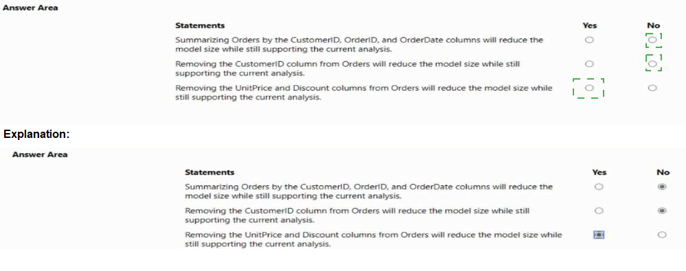
You have a Power Bl report named Orders that supports the following analysis:
• Total sales over time
• The count of orders over time
• New and repeat customer counts
The data model size is nearing the limit for a dataset in shared capacity. The model view for the dataset is shown in the following exhibit.

Explanation:
The question requires evaluating three statements about reducing the Power BI data model size while still supporting the specified analyses: total sales over time, count of orders over time, and new/repeat customer counts. Each statement must be assessed independently to determine if it reduces model size without breaking the required analytical capabilities.
Correct Option:
Statement 1: No
Summarizing Orders by CustomerID, OrderID, and OrderDate aggregates data at the order header level, removing line-item granularity. This would prevent calculating total sales (which requires summing UnitPrice × Quantity × (1-Discount) at the line level) and would not support new/repeat customer analysis that requires individual transaction dates. Model size may reduce, but current analysis cannot be supported.
Statement 2: No
Removing CustomerID from Orders would break the relationship between Orders and Customers tables. Without this foreign key, you cannot identify which customer placed each order, making new and repeat customer analysis impossible. While this would reduce model size, it destroys the analytical capability for customer-centric metrics.
Statement 3: Yes
Removing UnitPrice and Discount columns from Orders reduces model size without impacting the required analyses. Total sales over time can still be calculated from the existing LineTotal or extended amount column typically present in order fact tables. Count of orders and customer counts do not require these pricing columns. This is a safe optimization.
Reference:
Microsoft Learn: Data reduction techniques for import modeling - https://learn.microsoft.com/en-us/power-bi/guidance/import-modeling-data-reduction
Microsoft Learn: Remove unnecessary columns - https://learn.microsoft.com/en-us/power-bi/guidance/star-schema#remove-unnecessary-columns
| Page 2 out of 29 Pages |